 +91-7079 000 777
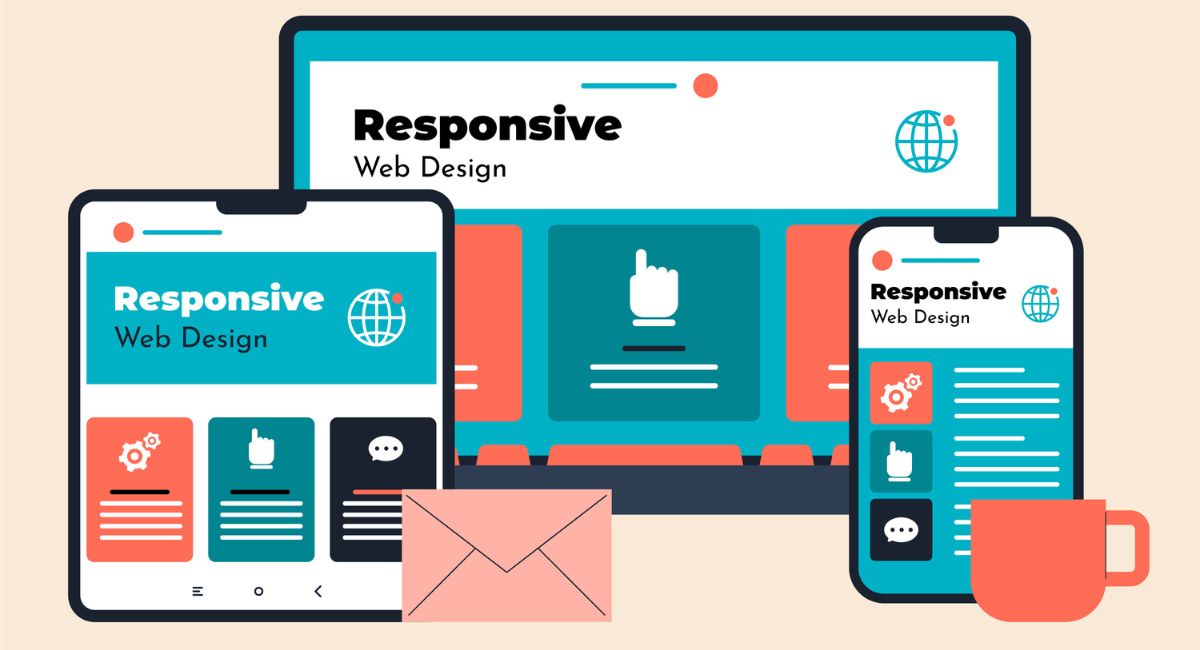
Let me guess, you are looking for a website that looks amazing and functions seamlessly on any device. Or in simple words, you are looking for a website that adapts like a pro. If yes then you are at the right place. We, Shish Technology, the leading and growing web development firm in Patna are compelled to to design a website that not only grabs attention but also keeps visitors coming back for more.
Let us learn first what a responsive website looks like and understand how we can be the best solution for this!
What Is Responsive Website Design?

Let’s start with the basics; Responsive website design is a web development approach where a website automatically adjusts its layout and content based on the screen size and orientation of the device. Whether someone is browsing your site on a smartphone, a tablet, or a desktop, the site will always look great and be easy to navigate. It’s like having one website with superpowers – adaptable, flexible, and always ready to impress.
This is it, but have you ever thought that why does it matters? Well that’s because more people are browsing the web on their mobile devices than ever before. Imagine a potential customer trying to check out your site on their phone, only to be met with teeny-tiny text and images that refuse to scale. Not cool, right? That’s where responsive design swoops in to save the day!
Why Responsive Web Design Is a Game-Changer
- Improved User Experience
When your website works flawlessly across different devices, visitors stay longer and engage more. It’s like rolling out the red carpet for every user! A smooth browsing experience encourages users to explore more pages, reducing bounce rates. - Increased Mobile Traffic
Did you know that mobile traffic accounts for more than half of all web traffic? If your site isn’t mobile-friendly, you’re potentially losing out on a huge chunk of visitors. With a responsive web design, you can tap into the growing number of mobile users and reach a wider audience. This not only expands your potential customer base but also strengthens your online presence across all platforms. - Faster Load Times
Nobody likes waiting around for a website to load. Responsive websites are designed to load quickly on all devices, ensuring a smooth and speedy user experience. Faster load times keep visitors from leaving out of frustration, which directly improves engagement. Plus, optimized loading speeds can contribute to better search engine rankings, giving your site a competitive edge. - Better SEO (Search Engine Optimization)
Google loves mobile-friendly websites, and a responsive design can help boost your search engine rankings. More visibility means more potential customers finding you online. As search engines prioritize websites that offer a great mobile experience, having a responsive site can significantly improve your chances of appearing on the first page of search results. - Easier Maintenance and Lower Costs
Instead of managing separate websites for mobile and desktop, a responsive website means less work and lower costs in the long run. A win-win for your time and budget! With a single responsive site, updates are applied across all devices, streamlining your web management process. This not only saves time but also ensures consistency in your brand's messaging and design.
What Makes a Website Truly Responsive?

- Flexible Grids and Layouts
A responsive design relies on flexible grids that adjust proportionally to fit different screen sizes, instead of using fixed-width layouts that may not look right on every device. This approach allows elements on the page to resize fluidly, ensuring that the website maintains a visually appealing and well-organized structure, no matter if viewed on a small smartphone screen or a large desktop monitor. - Fluid Images
Images within a responsive design automatically resize based on the screen dimensions, making sure they appear crisp and clear without losing quality or causing layout issues. By adapting the image size, they load quickly and don't distort or overflow the boundaries, providing a seamless visual experience across various devices. - Media Queries
Media queries are CSS techniques that enable different styles to be applied to a website depending on the device's screen size, resolution, or orientation. This "conditional styling" allows the website to present the most appropriate layout for each device, ensuring the content remains accessible and visually optimized for everything from smartphones to desktop displays. - Touch-Friendly Navigation
Navigation menus, buttons, and other clickable elements in a responsive design are designed to be touch-friendly, ensuring they are large enough to tap comfortably, even on smaller screens. This approach enhances the overall user experience by reducing accidental clicks and making it easier for users to browse the site without any frustration. - Cross-Browser Compatibility
A truly responsive website is tested to function consistently and display correctly across all major web browsers, such as Chrome, Firefox, Safari, and Edge. This compatibility ensures that no matter what browser users prefer, the website’s appearance and functionality remain consistent, providing a smooth experience across different platforms and devices.
How Shish Technology Can Help You?
At Shish Technology, we don’t just build websites – we create digital experiences that connect with your audience. Here’s how we make it happen:
- Detailed Discovery Process: We begin by learning about your brand, your goals, and your audience to design a site that truly reflects your business. We discuss functionality, design preferences, and audience demographics to tailor the website to meet specific needs.
- Tailored UI/UX Design: We go beyond basic templates, focusing on a unique design that aligns with your brand’s identity. Our UI/UX approach ensures that every button, page, and interaction is crafted to enhance user experience, making navigation intuitive and engaging.
- Mobile-First Approach: With mobile traffic accounting for more than half of web visits, we adopt a mobile-first design approach to ensure seamless performance on smaller screens, followed by scaling up for larger devices.
Agile Development Process: We work in stages, keeping you informed and involved in every phase. From concept to launch, our agile development process allows for flexibility, ensuring that we meet deadlines without sacrificing quality.
Why Trust Shish Technology with Your Responsive Web Design?
At Shish Technology, we don’t just create websites – we craft digital experiences. Here’s why choosing us for your responsive design needs is the smart move:

- Expertise You Can Rely On
Our team has years of experience in web design, and we stay up to date with the latest trends and best practices. We know what works and what doesn’t.
- Tailored Solutions for Your Business
No two businesses are the same, and neither should be their websites. We take the time to understand your unique needs and deliver custom solutions that align with your goals.
- A Proven Track Record
Don’t just take our word for it. Our portfolio speaks for itself! We’ve helped numerous businesses transform their online presence with stunning, responsive websites.
- Ongoing Support and Maintenance
Our commitment doesn’t end with launching your website. We offer continuous support and maintenance to keep your site updated, secure, and functioning at its best. Whether it’s adding new features, troubleshooting issues, or making periodic updates, we’re here to ensure your website stays ahead of the curve.
- SEO-Friendly Approach
At Shish Technology, we design websites with search engines in mind. Our responsive web designs are optimized to improve your search engine rankings, driving more organic traffic to your site. We implement best practices for SEO from the ground up, so your website not only looks great but also performs well in search results.
- Transparent and Collaborative Process
We believe in working closely with our clients, keeping you in the loop at every stage of the design process. From initial planning to final launch, we ensure that your feedback is incorporated, and your expectations are met. Our transparent approach means you’ll always know what’s happening, making the entire journey stress-free and rewarding.
What Technology We Use For Responsive Web Design
At Shish Technology, we employ the latest and most reliable technologies to ensure your site is fast, reliable, and accessible.

- HTML5 and CSS3 for Responsive Design: Using the latest web standards, we implement HTML5 and CSS3 to create flexible layouts, ensuring smooth transitions between desktop, tablet, and mobile views.
- JavaScript and jQuery for Dynamic Content: Our developers use JavaScript and jQuery to add interactive elements that enhance user engagement, such as animations, sliders, and responsive menus. This approach makes your site more engaging without sacrificing loading speeds.
- Content Delivery Network (CDN) Integration: To further speed up loading times, we integrate a CDN, which caches and delivers content from servers closer to your audience. This reduces latency and ensures a fast experience, regardless of user location.
- Lazy Loading and Image Compression: For optimized loading, we implement lazy loading, ensuring that images and media load only when they appear on the screen. Additionally, we compress images to maintain high quality while minimizing file size, speeding up page loading times.
- SEO-Optimized Coding: Every website we develop is coded with SEO in mind, using structured data, clean URLs, and meta tags to improve visibility in search engines. This ensures that your website not only looks great but also ranks well.
- Secure Hosting and SSL Certification: Security is crucial for online credibility. We prioritize secure hosting solutions, SSL certification, and regular updates to protect your site from vulnerabilities and keep it compliant with security standards.
Industries We Serve
Shish Technology has experience across various industries, and we tailor our approach to the unique needs of each sector. Here’s a look at the primary industries we serve:
Nonprofits: We create user-friendly websites for nonprofits to facilitate donations, highlight events, and promote causes with compelling designs that resonate with audiences.
E-commerce and Retail: We specialize in designing responsive e-commerce sites that provide smooth navigation, secure payment gateways, and a seamless shopping experience to boost conversion rates.
Healthcare: Our team develops intuitive websites for healthcare providers, including appointment booking, telehealth integration, and secure data management to meet regulatory requirements.
Education: We create educational websites with responsive layouts, LMS (Learning Management System) integrations, and interactive elements that cater to students, parents, and educators, making information accessible and engaging.
Real Estate: We design websites for real estate agents and agencies with property listings, map integrations, and lead capture features, optimized for all devices to make property browsing easy and enjoyable.
Finance and Insurance: With a focus on secure data handling and user-friendly navigation, our websites for finance and insurance companies help clients find relevant information, apply for services, and manage accounts confidently.
How Does Responsive Web Design Improve SEO?
Google and other search engines prioritize mobile-friendly websites in their search rankings, which means a responsive website can help you achieve higher visibility. Responsive design eliminates the need for separate mobile and desktop versions of a website, preventing issues like duplicate content and inconsistent SEO practices. Additionally, faster page loading times on mobile devices further enhance your SEO performance.
What Are the Key Elements of a Good Responsive Design?
A good responsive design includes flexible grids and layouts that adapt to different screen sizes, fluid images that automatically resize to fit the screen, and media queries that customize the appearance based on device capabilities. Additionally, it incorporates touch-friendly navigation for easier interaction on mobile devices and ensures cross-browser compatibility for a seamless experience across all platforms.
Will I Be Able to Update My Responsive Website Easily?
Yes, we design responsive websites using content management systems (CMS) like WordPress, which allow you to easily update content, images, and other elements on your website without needing technical expertise. We also offer training and ongoing support to ensure you’re comfortable making updates whenever necessary.
What Kind of Post-Launch Support Does Shish Technology Offer?
After launching your responsive website, we provide ongoing support and maintenance services to keep your site secure, up to date, and running smoothly. This includes regular updates, performance monitoring, troubleshooting any issues, and even implementing new features as your business grows. We’re committed to being a long-term partner in your digital success.
How Do I Know If My Website Is Currently Responsive or Needs an Update?
You can easily check if your website is responsive by resizing your browser window to see if the layout adjusts smoothly, or by viewing it on different devices. If you need a professional assessment, Shish Technology offers a free website audit to help you identify whether your site meets modern responsive design standards or if it needs a refresh.
Some Frequently Asked Questions on Responsive Website Design
Yes, a well-designed responsive website will work on older devices and across different browsers like Chrome, Firefox, Safari, and Edge. At Shish Technology, we test websites to ensure cross-browser compatibility and adaptability for various screen resolutions and device capabilities. This ensures that users on both newer and older devices get a consistent browsing experience.
We can absolutely make your existing website responsive without starting from scratch. We’ll assess the current design and code to determine the necessary changes for achieving a responsive layout. In some cases, however, a complete redesign may be more beneficial to modernize your website and implement best practices in responsive web design.
The timeline for creating a responsive website depends on the project’s complexity, content requirements, and any special features or functionalities. On average, a basic responsive website can be completed in 4-6 weeks. More complex websites, such as those with custom integrations or unique features, may take longer. We’ll provide a detailed project timeline during the initial consultation.
The cost of a responsive website design can vary based on factors such as the number of pages, specific features, and customization requirements. At Shish Technology, we offer personalized quotes after assessing your needs and business goals. We ensure that our pricing is transparent and competitive, with no hidden fees, so you know exactly what you're getting.
A good responsive design includes flexible grids and layouts that adapt to different screen sizes, fluid images that automatically resize to fit the screen, and media queries that customize the appearance based on device capabilities. Additionally, it incorporates touch-friendly navigation for easier interaction on mobile devices and ensures cross-browser compatibility for a seamless experience across all platforms.
Yes, we design responsive websites using content management systems (CMS) like WordPress, which allow you to easily update content, images, and other elements on your website without needing technical expertise. We also offer training and ongoing support to ensure you’re comfortable making updates whenever necessary.
After launching your responsive website, we provide ongoing support and maintenance services to keep your site secure, up to date, and running smoothly. This includes regular updates, performance monitoring, troubleshooting any issues, and even implementing new features as your business grows. We’re committed to being a long-term partner in your digital success.
You can easily check if your website is responsive by resizing your browser window to see if the layout adjusts smoothly, or by viewing it on different devices. If you need a professional assessment, Shish Technology offers a free website audit to help you identify whether your site meets modern responsive design standards or if it needs a refresh.